
In-house at TotallyMoney | My role: Lead UI Designer
Read my related Medium articleTotallyMoney is a popular app that sets out to help users improve their financial situation by learning smarter habits, improving their credit score, and getting access to better borrowing. The product has over five million users in the UK.
In a marketplace full of lookalike apps, it is not easy to make your product visually distinctive while maintaining exemplary standards of usability. This is the story of two projects I initiated to attempt to achieve that.
I joined TotallyMoney in February 2020, just before the pandemic struck. I was the company's first permanent UI specialist hire, and I could see that there was a lot of potential for improvement of the visual design and to stamp my mark on the product. The screens below show how it looked before I started work on it.
How the product looked before I joined the company
The company had just been through a rebrand, the tone of which was friendly, embracing and helpful. However, the new brand had not been applied to the product other than a cursory splash of the new primary deep indigo colour. I spent some time auditing and evaluating the app, which has many facets, before embarking on a project to bring vibrancy and life to it by creating a new visual design language.
Success for this endeavour would be to lift the aesthetic standard of the TotallyMoney app to match or exceed its competitors.
I gave my project a simple but memorable name: Future Vision. The company wanted to retain a few ownable features from the old design, including the dotted score wheel on a deep indigo background. I started by taking the retained features, combining them with the best elements of the new brand, and exploring how a new visual language could be built around them.
The goal was to give the product a unique personality in a crowded marketplace. It would be modular, scalable and promote the values of the company. I looked at how aesthetics could be used to engage our users further, encouraging them to discover more genuinely useful content.
After sharing my progress with the Product Design Director, I added some new features and designed many more iterations before a viable dashboard was settled upon:
An early viable dashboard design
As I progressed, I kept and refined a component sheet. It was essential to create pattern styles that were flexible and could be scaled easily and rapidly. A major issue with the old design was that it was so static and difficult to build upon.
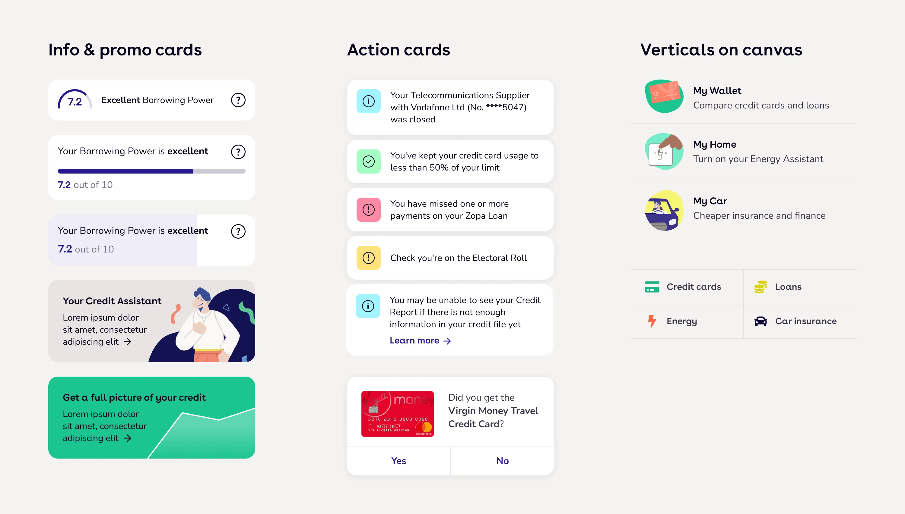
A component sheet from the midpoint of the project
At this point, I presented my proposals to the senior management team. There would be considerable engineering effort required to apply the Future Vision to the entire app, and I needed the SMT's buy-in for this to be greenlit. After demonstrating how the new design language would align perfectly with the company's strategic priorities, I was extremely encouraged by their enthusiastic response. Below is a video of the prototype that I presented to the team:
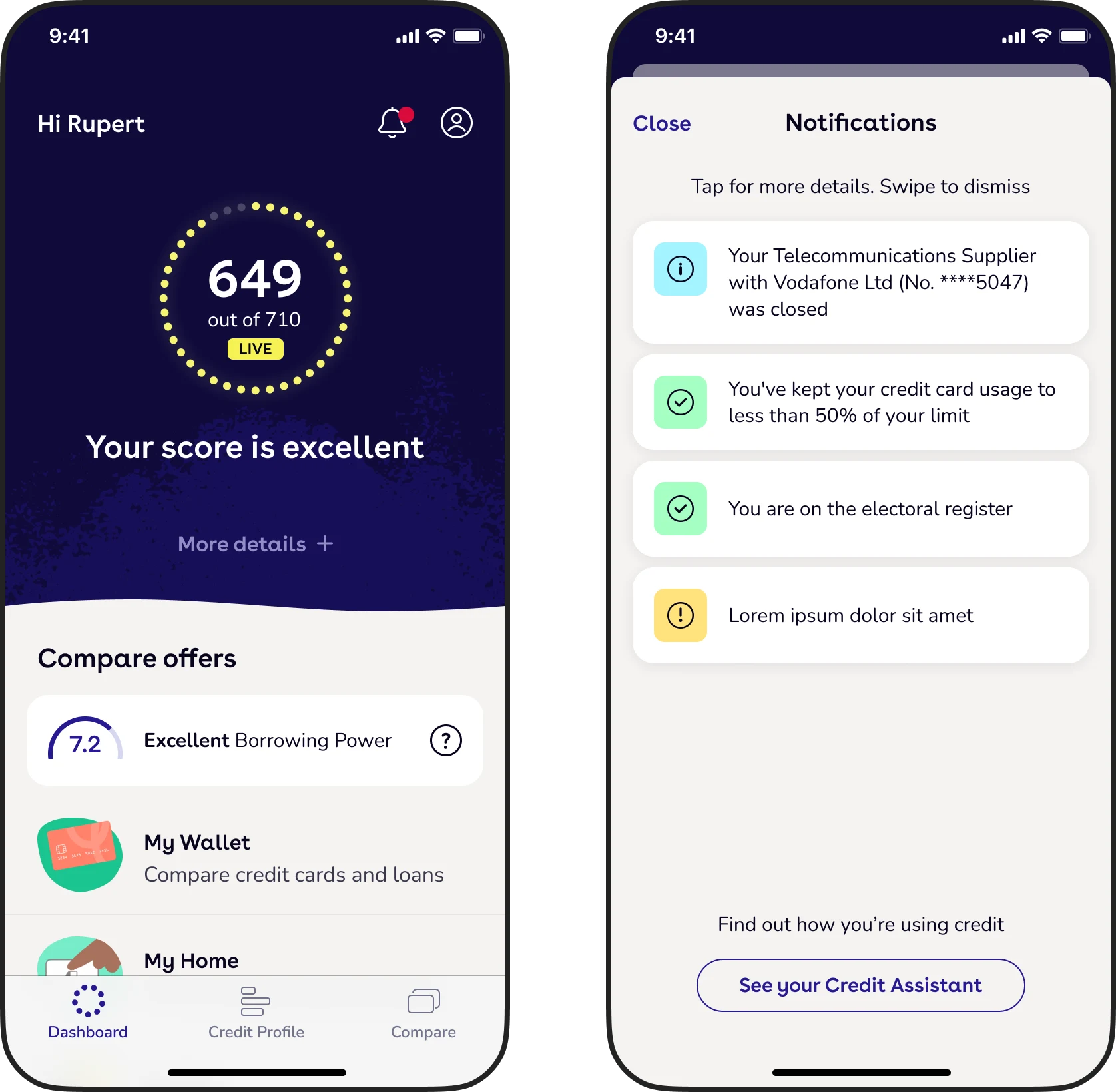
Prototype I presented to the management team (created in Principle)
Designs for a future notifications centre
In addition to the dashboard, I explored how the Future Vision styles could be widely applied and finalised a set of rules. Working closely with our engineering and product design teams, I oversaw the addition of the new design language to the product over a series of months.
As a result of the Future Vision work, the product UI became consistent, coherent and much more appealing. New features were able to be designed and built at speed.
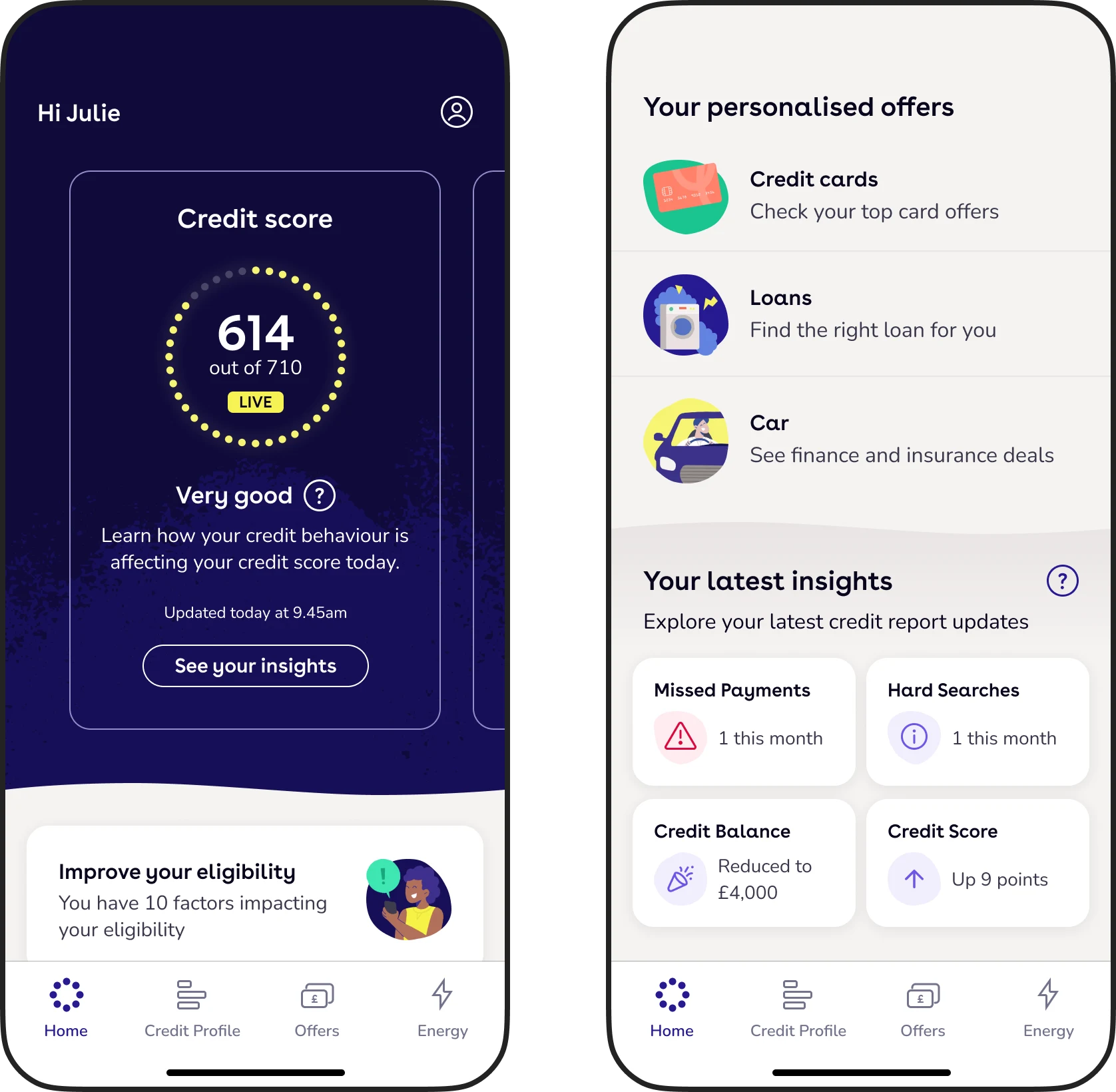
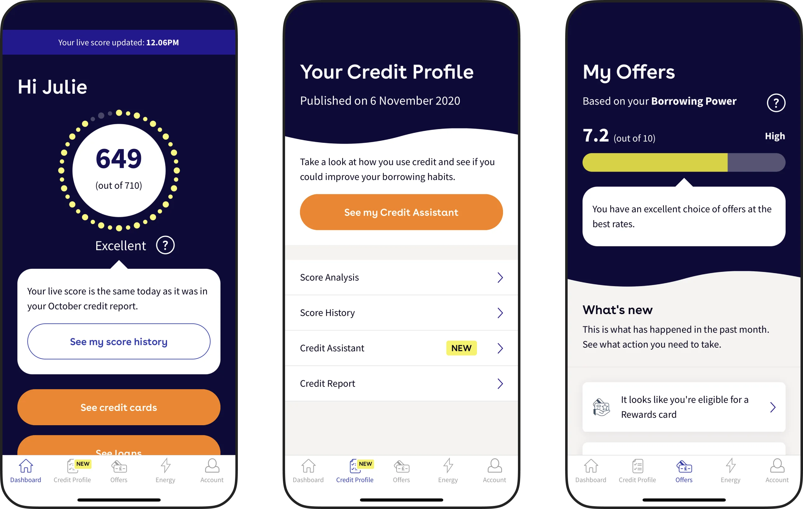
The dashboard as it appeared in the live product in 2022
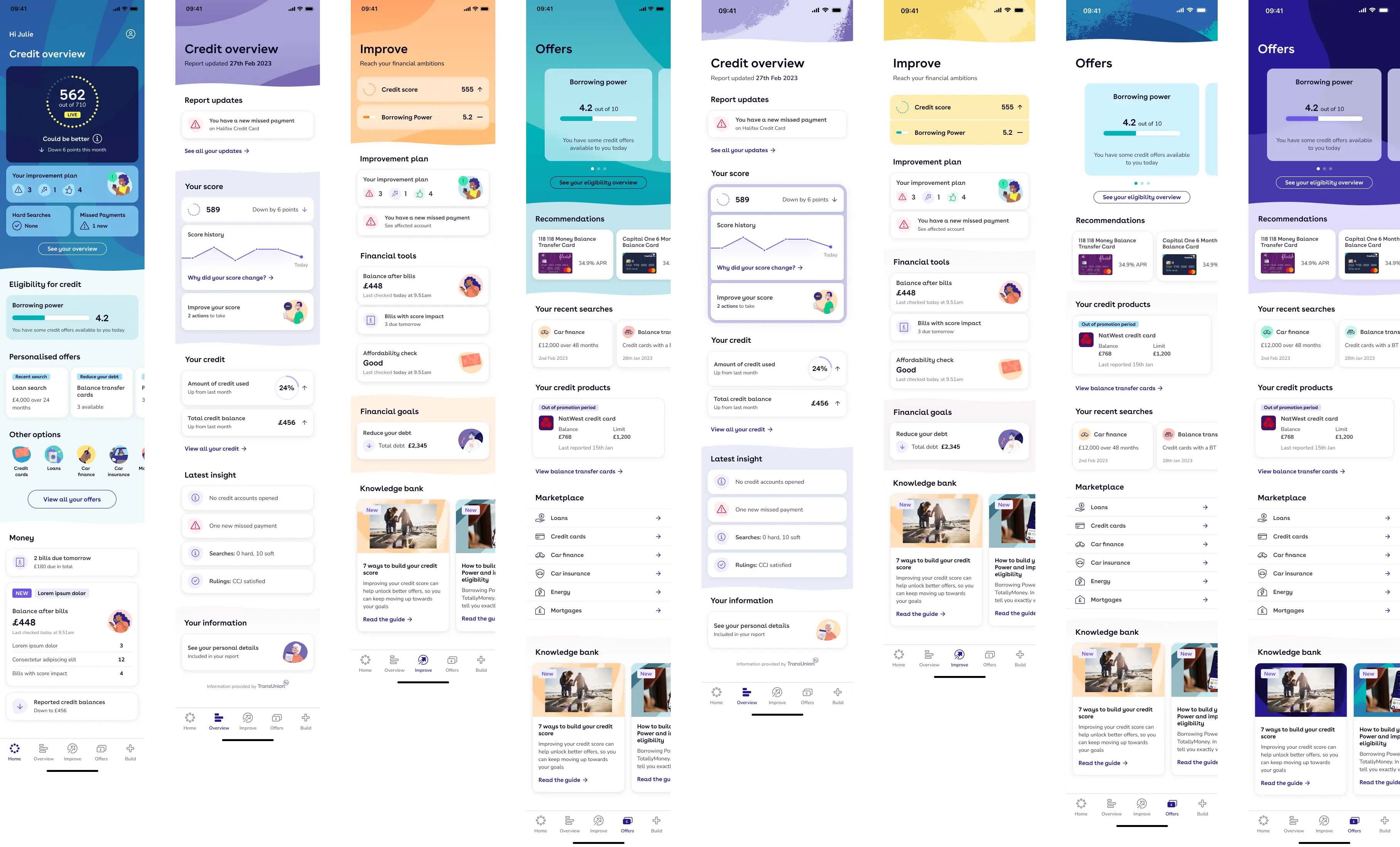
A selection of screens from the app
The concepts underpinning the Future Vision project became embedded in the culture of the product design team. I coached the team on how the styles should be used and built an entirely new design system around them. However, nothing ever stands still and after a year or so in use, it was time to evolve the visual language further.
In early 2023, I started a new project with an imaginative title: Future Vision 24. The evolution was inspired by some work that the creative team were doing in pushing the brand forward, primarily through new TV and online advertising campaigns. I was impressed by their efforts to make the brand feel even warmer and friendlier; a comforting friend for our customers during difficult financial times.
A small sample of my early exploration for the project,
experimenting with a more liberal use of colour
I explored ways in which we might take cues from the new brand work, and infuse the product with a softer palette, larger corner radiuses, more refined typography and greater use of our signature illustrations. I also reworked the tab bar icons and rationalised the hero headers on the top-level screens. Eventually, I decided to keep the majority of the UI neutral, referencing our primary indigo brand colour, and bring through the warmer tones in small pops.
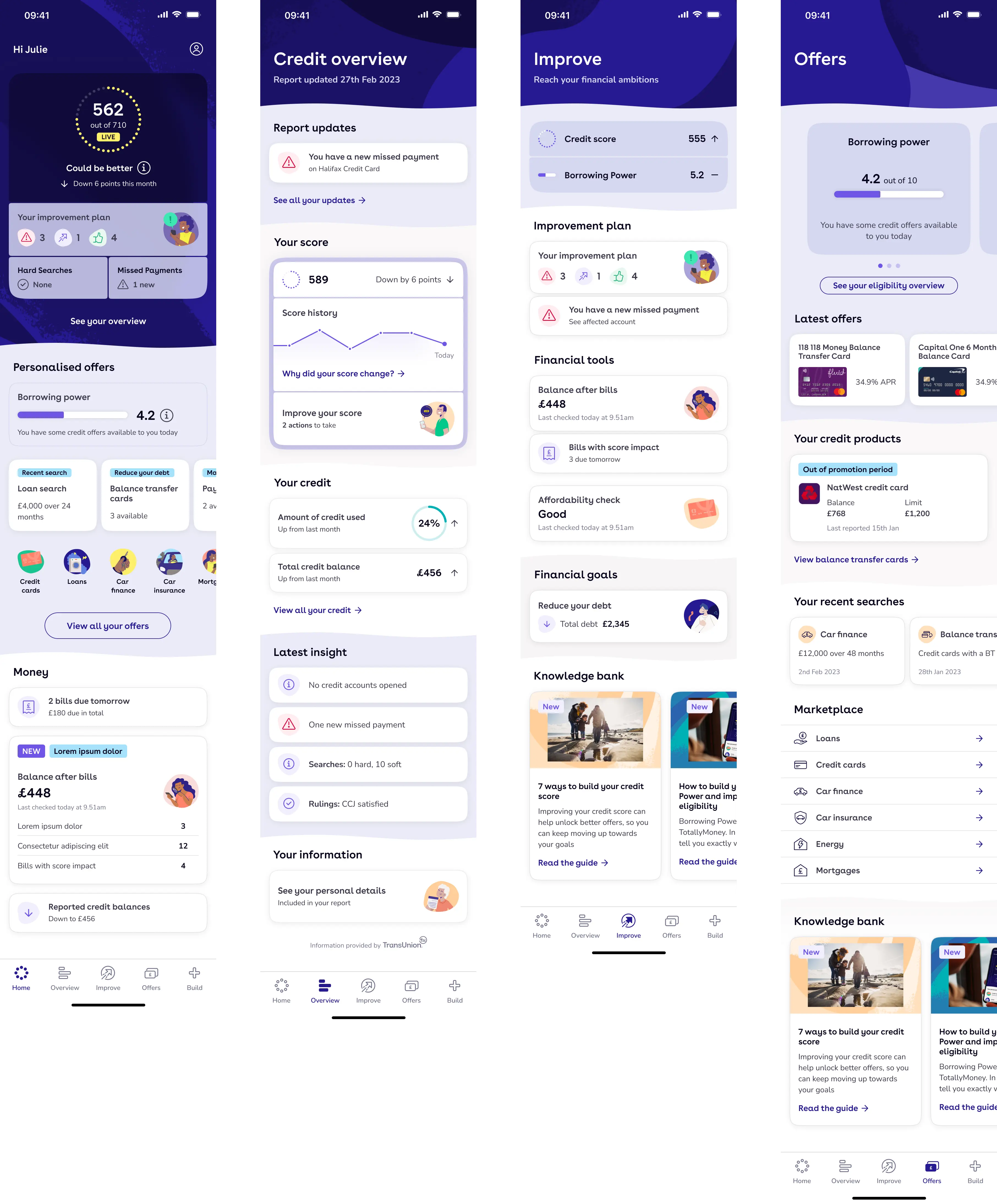
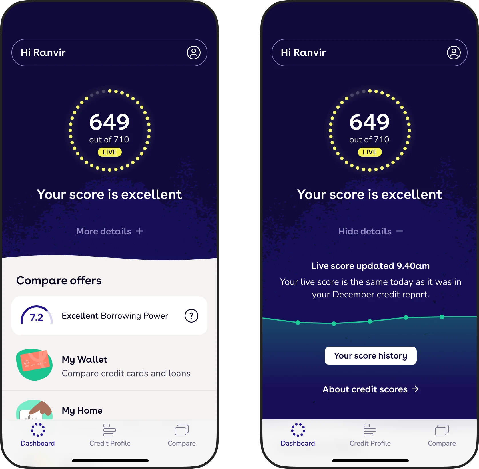
The route that we decided to take forward
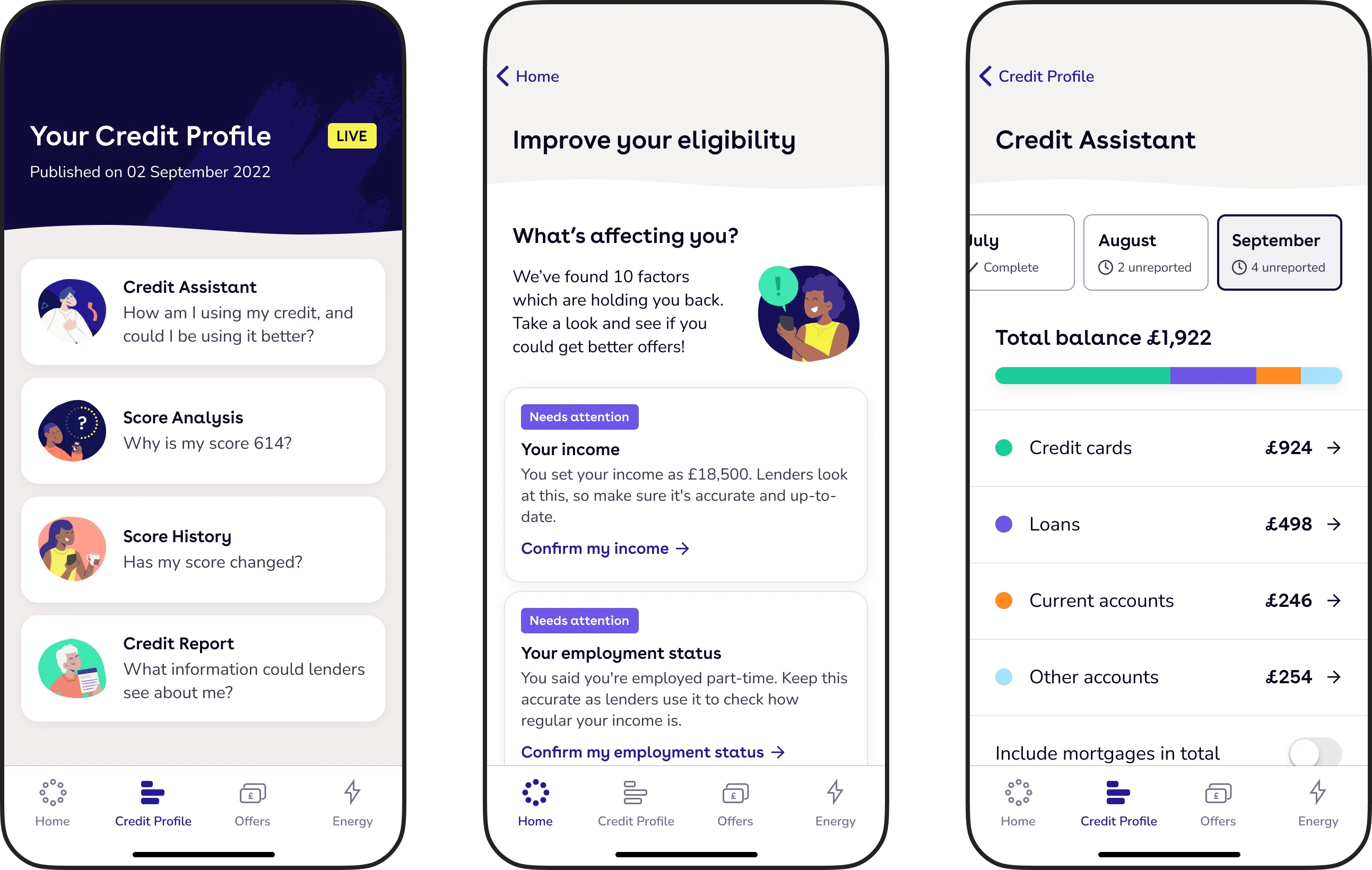
While I worked on the visual design, the other leads in the product design team were focused on improving the IA of the product. We ran our projects in parallel, and I applied my evolved design language to their wireframes. As a result, the designs shown here are not necessarily the same as will be seen in the live product – rather, they are indicative of our new direction.
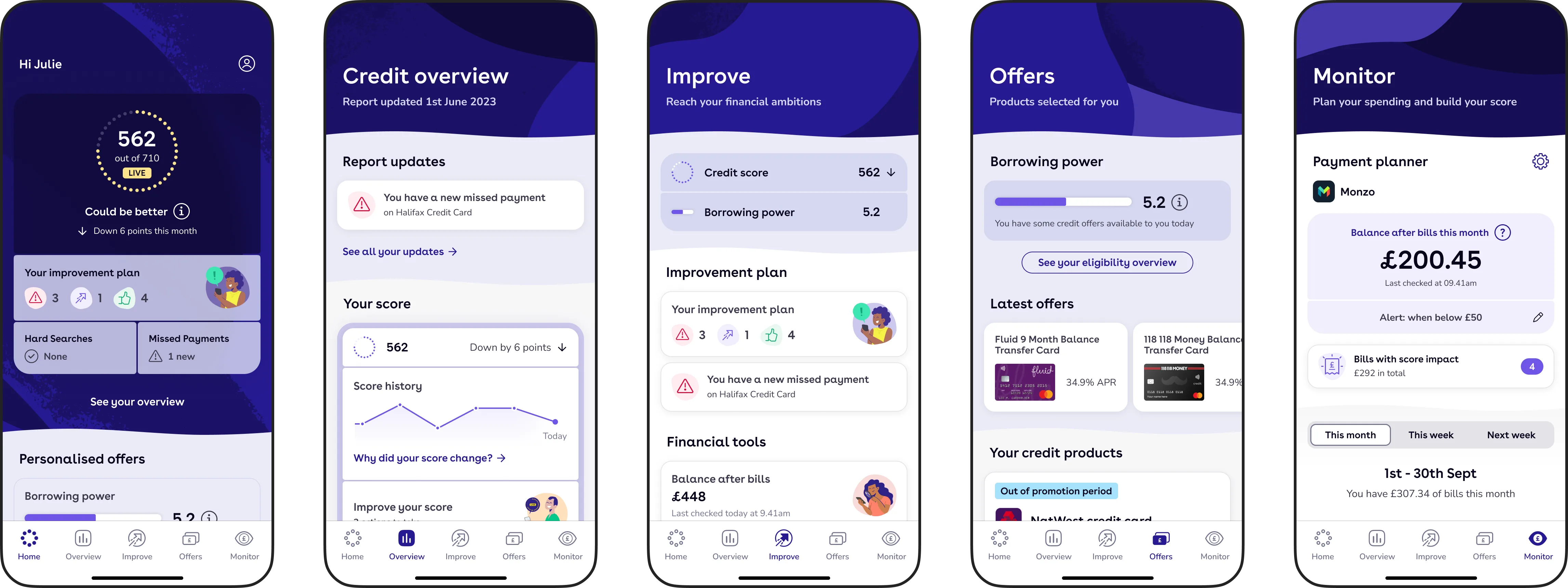
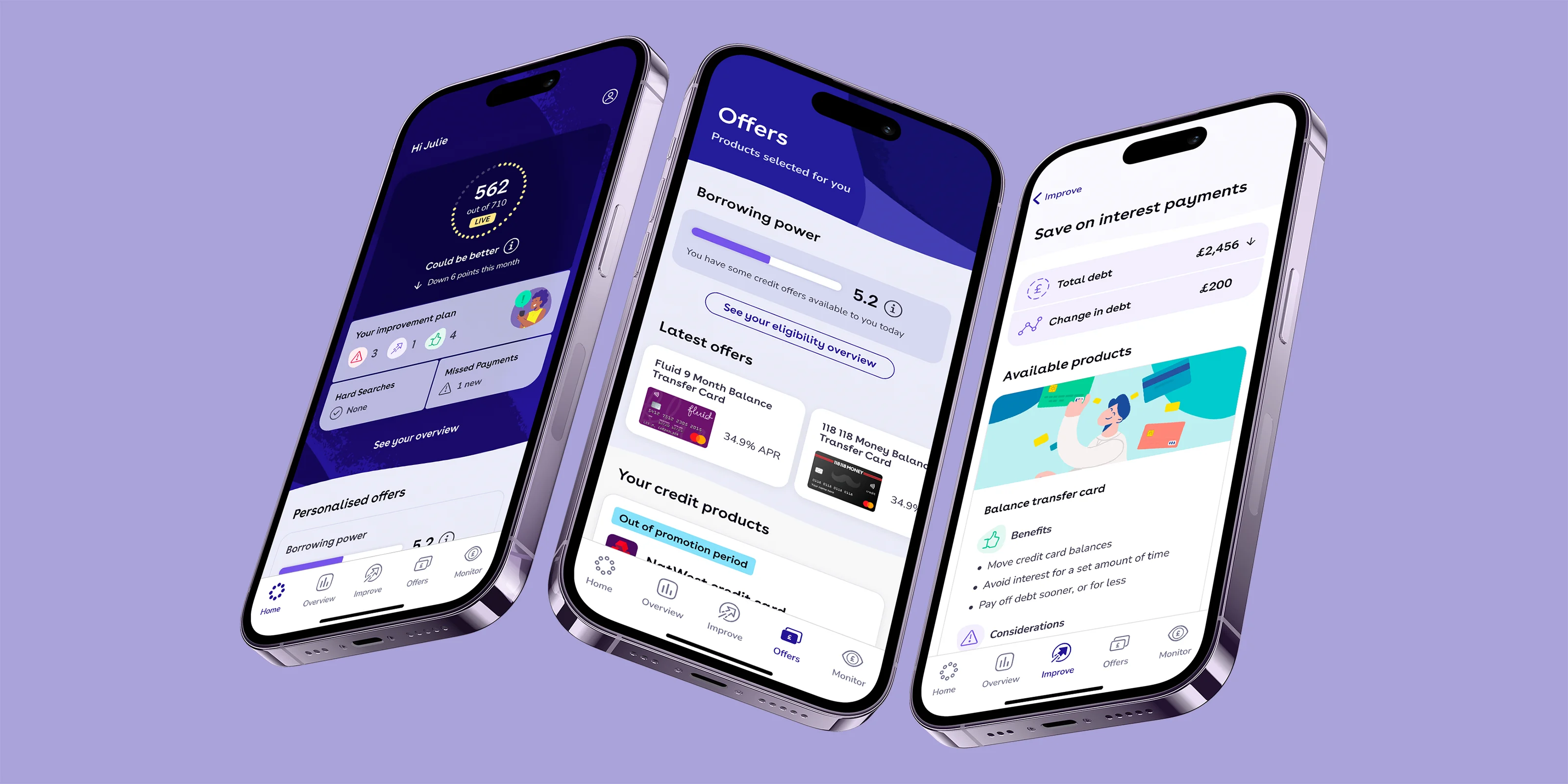
The final top-level concept screens
I came up with the concept of a 'supercard' (as can be seen in the screens above) to link related pieces of content together visually, while allowing separate the cards to send the user to different locations. This has the dual benefit of saving space and creating a clear association between pieces of content for our users.
As with my original Future Vision project, the Future Vision 24 project needed to gain buy-in from the senior management team. I put together a highly visual presentation demonstrating the evolution of the product since 2020. Again, I was extremely happy with their response to the new UI. I went on to share it widely with other teams within the company, to ensure that everyone was on board.
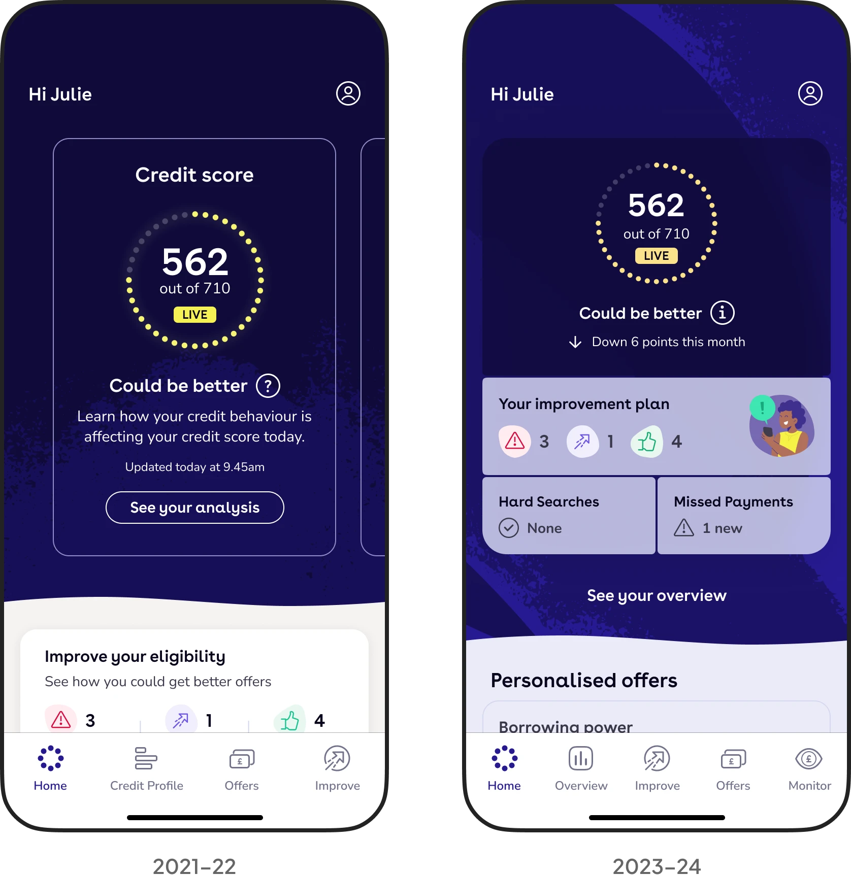
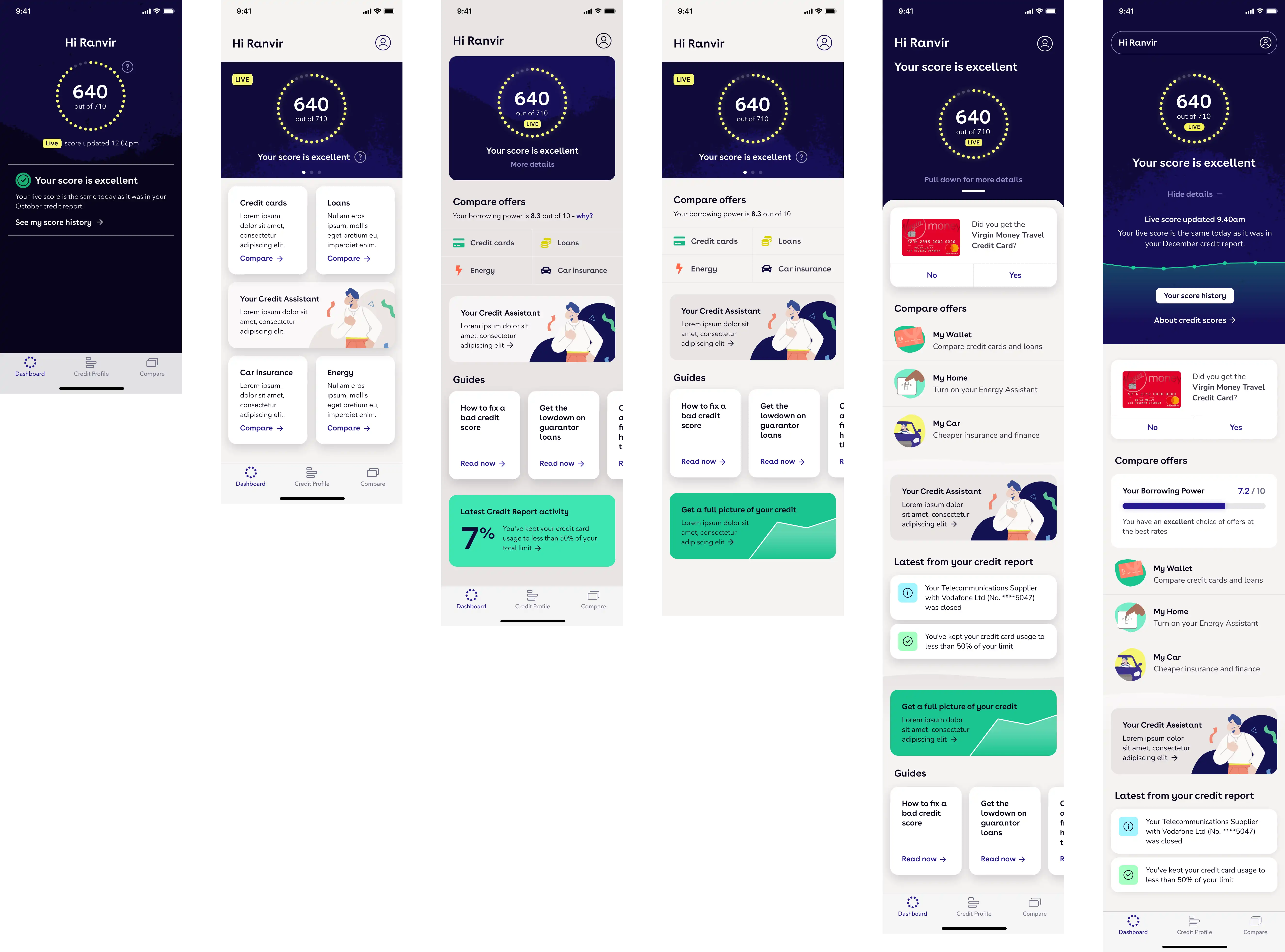
Showing the evolution of the dashboard, now known as the home screen
The Future Vision 24 design language has now been implemented in designs created by the whole product design team.
An oft-quoted line from Margaret Wolfe Hungerford is: 'beauty is in the eye of the beholder'. Like beauty, visual design is highly subjective. Evaluating the success of a visual design project is not easy. But what is undeniable is that TotallyMoney's new visual design language has helped to make the product much easier to work with, more scalable and more contemporary in appearance. As per my original goal, can it hold its head high amongst its peers? I certainly hope so.
The data shown in these designs is fictional.
Next project: Design system