
In-house at TotallyMoney | My role: Lead UI Designer
At the time I first joined TotallyMoney, there was an intention to build a design system but few foundations had been laid. There were a couple of disjointed and incomplete Sketch UI library files and an unrelated selection of components in Storybook.
One of my first tasks upon starting my new job was to conduct a UI audit. I discovered that the product had grown organically and as such was full of inconsistencies. There were at least 40 text styles, and multiple versions of each of the palette colours. As a result, it was hugely confusing to work on the product. It was clear that work should begin immediately on building a robust design system.
The company was still using Sketch at the time. My initial aim was to create a single strong, efficient, more comprehensive UI library file. I set up a completely new structure, based on Brad Frost's atomic principles but naming the levels in a more prosaic manner: foundations, elements and patterns.
I started with the most basic foundations: the palette, text styles, grids and buttons.
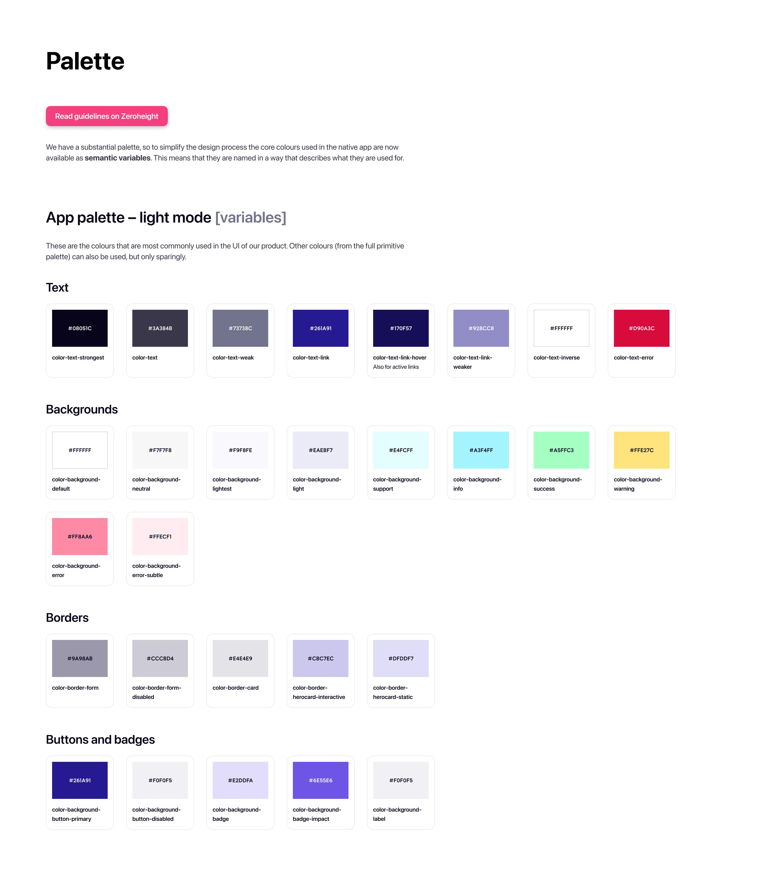
Part of the product palette
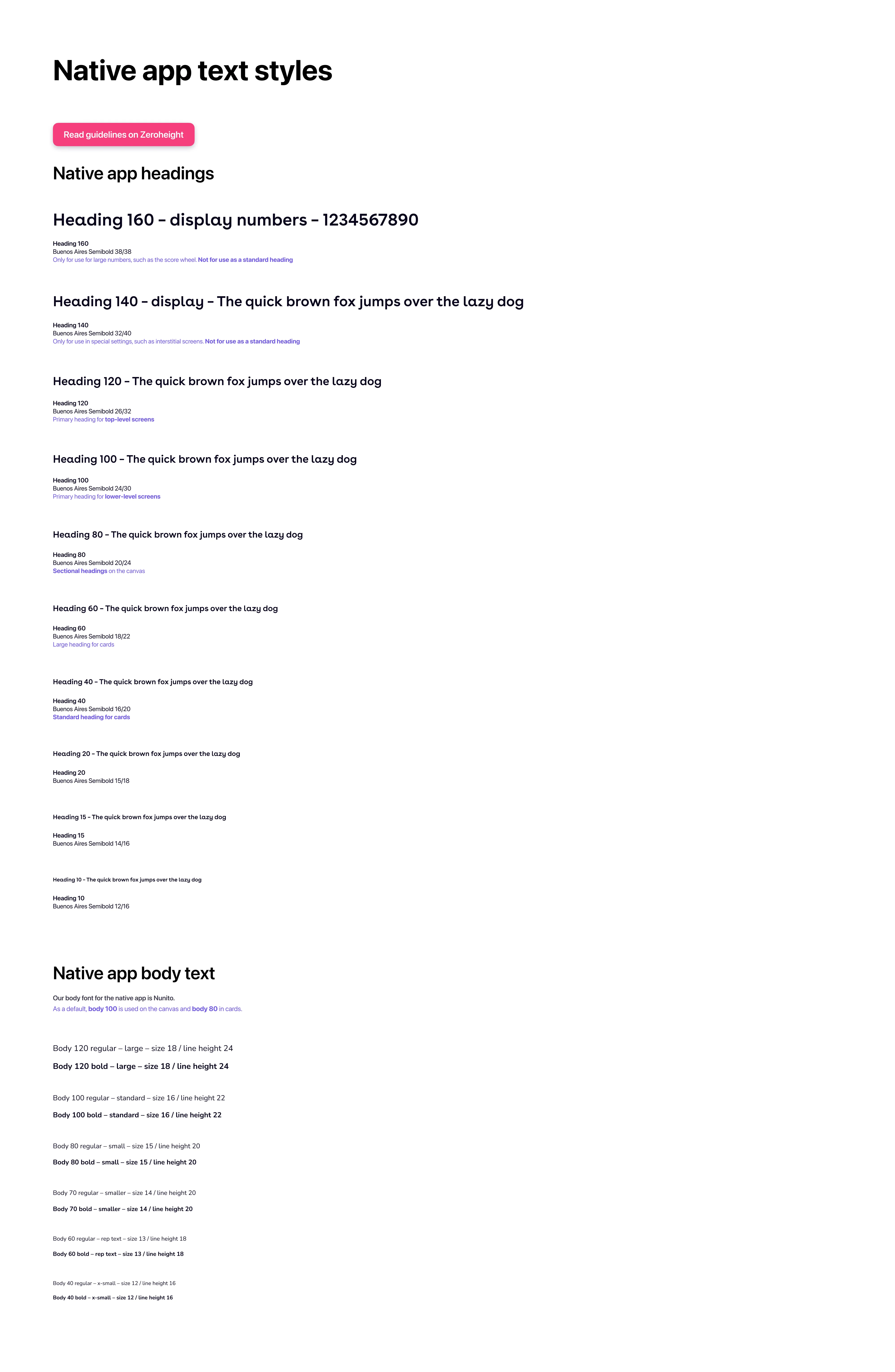
Text styles for the native app
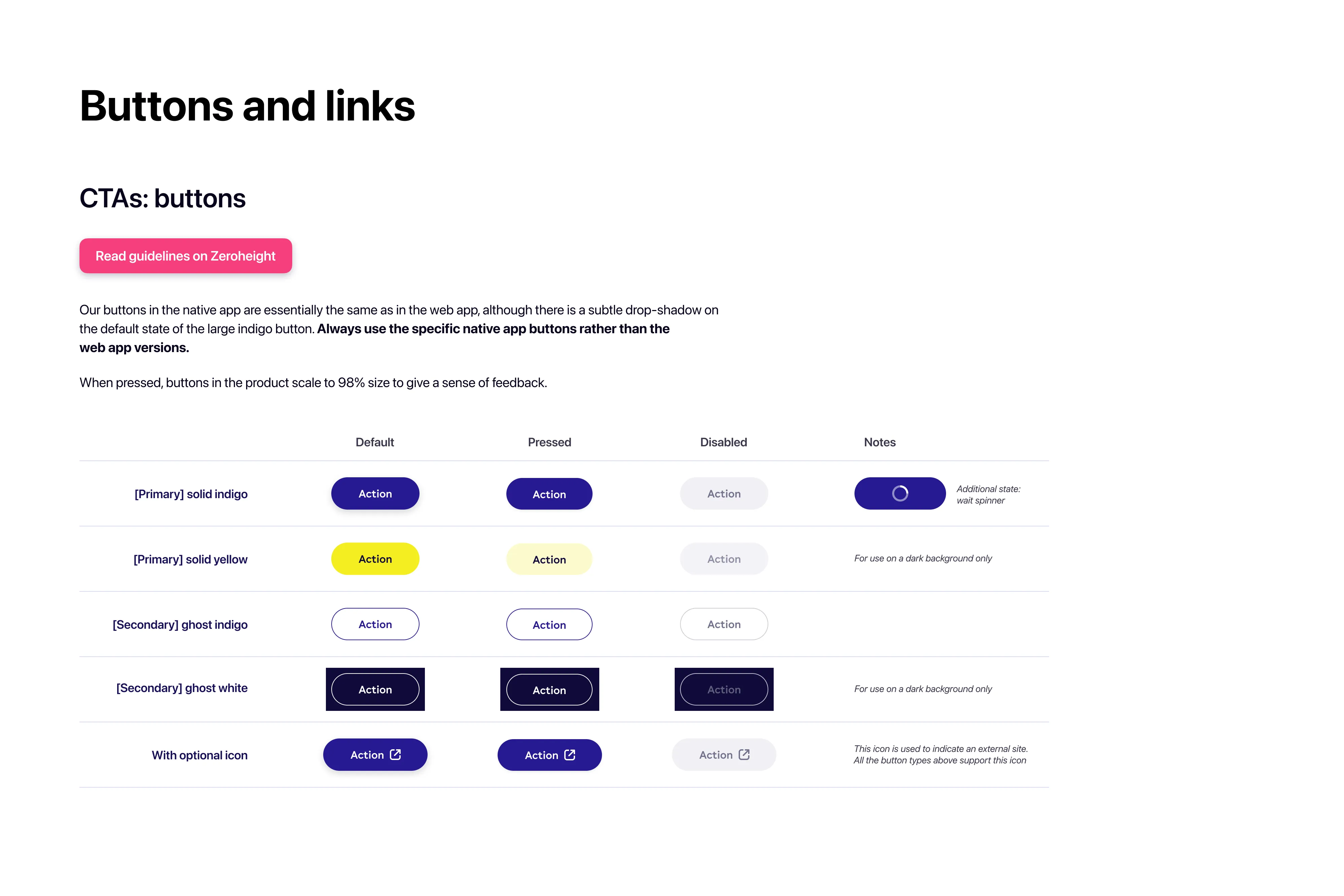
Buttons in the native app
At the beginning, the new UI library was universal, covering both the web and native apps. This would change when the future vision project focused on the native app first – more on this later.
In the summer of 2020 the design team moved from Sketch to Figma, to facilitate a more collaborative way of working. This decision transpired to be hugely beneficial. I leveraged Figma's excellent 'variants' feature to reduce the overall number of components and make the UI library easier to consume.
I then started to think about how the design and engineering teams could come together to build a proper design system.
Flexible information cards
I set up a Design System Guild comprising designers and engineers who had an interest in improving and bringing order to our product. To kick this off, and gain exposure for the new guild, I facilitated a workshop in which we all considered what we felt the design system should be. This was extremely useful in engaging the right people, and from it came a team who would initially meet fortnightly.
In addition to the main guild, we soon established a core group of four representatives from web engineering, native engineering, product design (myself) and creative design. We were given the time and space to work out the nuts and bolts of our new system, giving life to the decisions made by the wider guild. We figured out ways to align our Figma UI library and the Storybook component libraries, and agreed on shared priorities. After some deliberation we chose Zeroheight as the platform that we would use to tie together the loose ends of our nascent design system.
In-app notifications
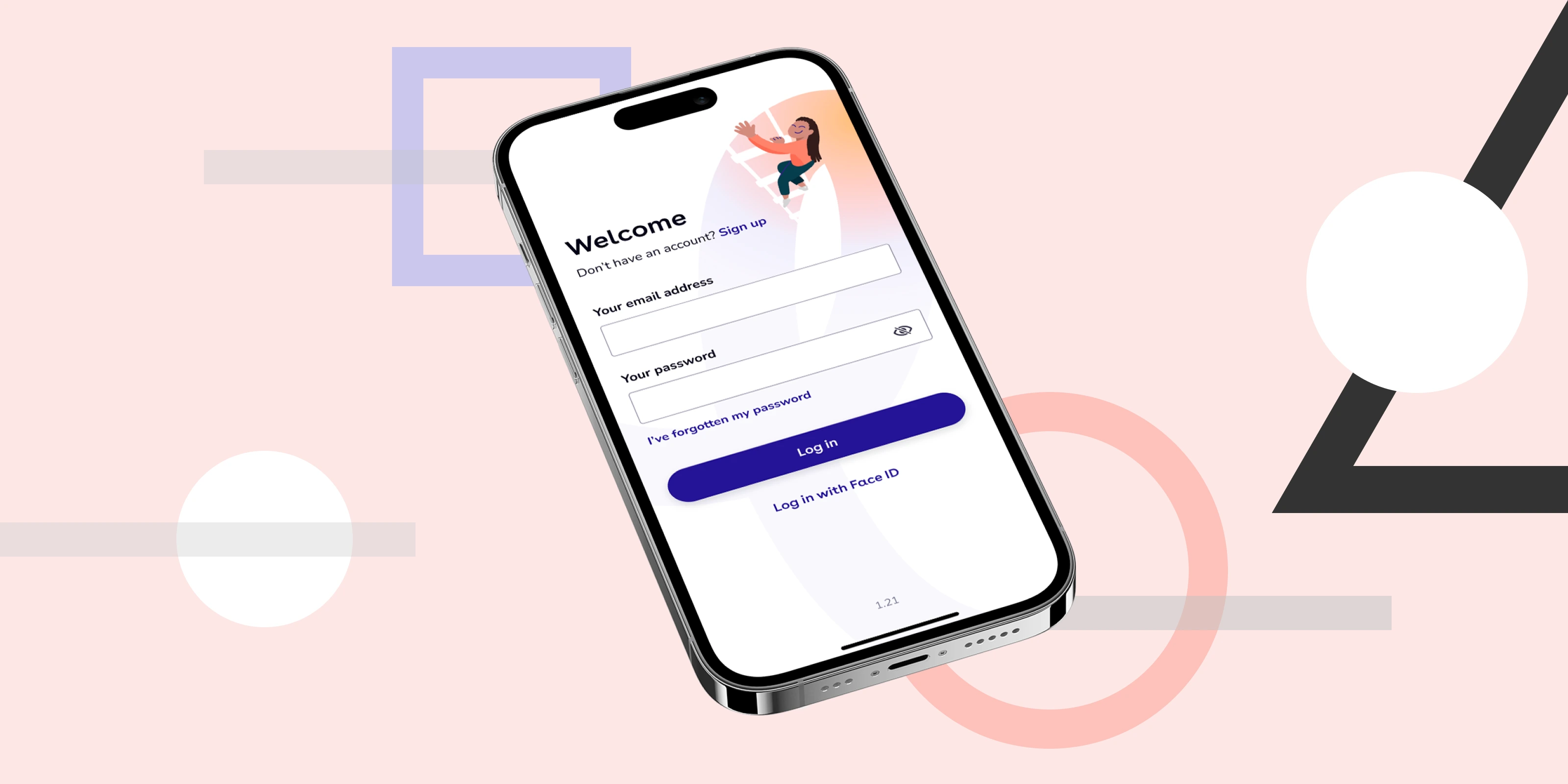
At the same time as the design system started to take shape, my work on the future vision project was accelerating. This concentrated initially on the native app, and resulted in a raft of new styles and patterns being created. The single unified UI library I had set up, shared between the web and native apps, now became difficult to maintain. I saw a need to break the library into three: shared foundations, web app and native app.
A selection of native app components
The visual design of the product was in a transitionary period. I was reluctant to add outdated, deprecated patterns to the Figma libraries, which sparked a few interesting discussions. I felt that the design system should be representative of the future of the product, and a few elements we wanted to keep from the past, rather than being a repository of absolutely everything.
Native app templates
To raise awareness of our new design system in the wider company, the core team of four representatives from design and engineering put together a presentation for our weekly company breakfast meeting. We explained in simple terms what a design system is, and launched a competition to come up with a name for our system. This garned unexpected levels of engagement – we ended up with more than 70 entries! Some funny, some clever, some bizarre.
A winner was chosen and the TotallyMoney Momentum Design System was born. My colleague Charlie Lewis created a logo for it, based on the clever concept of a Newton's Cradle.
I have worked hard to maintain a thorough, up-to-date system with key touchpoints in Figma and Zeroheight. It is a continual work in progress. For all the devotion the core team and I have for it, it will never be finished. It will, however, become more and more refined.
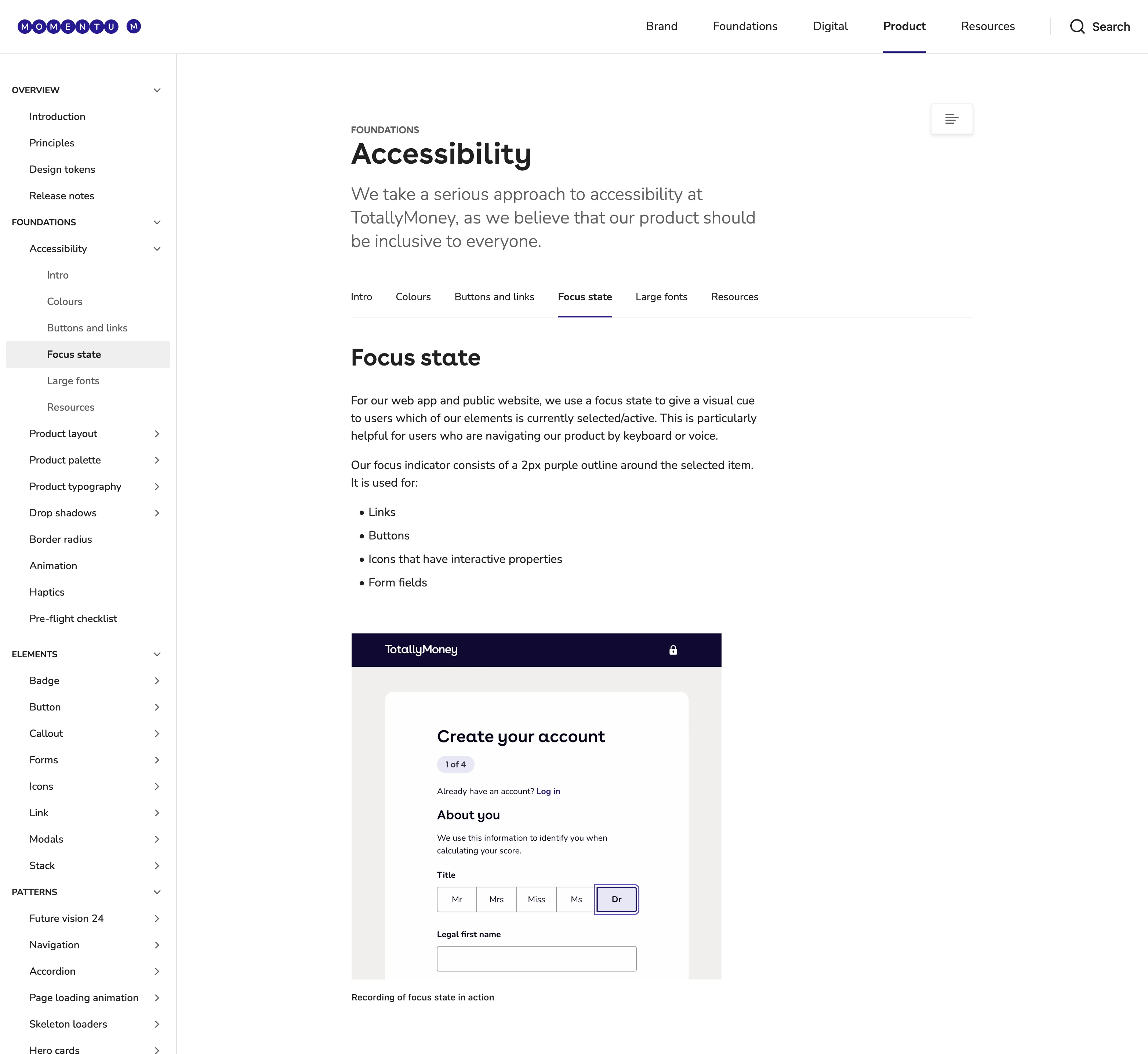
An example page from our Zeroheight platform
As our system matures, its tangible benefits are evident. We've seen much improved collaboration between the design and engineering teams, a much speedier workflow and a greater understanding of the way that the product is structured. We are now seeing a really strong and dedicated focus on making our product as inclusive as possible, with great improvements to accessibility.
We now bear the concerns of a mature design system: when and how to deprecate old styles and components, how to include beta patterns, how to automate as many processes as possible, and so on.
At the time of writing, I'm working on implementing variables in preparation for an anticipated dark mode for the product.